Blow Your Mind Conversion Rates! A/B test and Get the best results ever.
If your conversions happen on the web, then you have the extraordinary opportunity to test your assumptions, designs, and features, and figure out what works. A/B testing can optimise web experiences and your conversion rate.
The most common means of testing to improve conversions online is A/B testing, also known as split-testing. Getting more revenue-generating actions from the same amount of visitors. A/B testing will help you close the deal once a visitor has arrived at your website.
This is a great guide for SME’s wanting to dive into testing. “Testing is the crucible for decision making” Chris Goward
What is A/B testing?
A/B testing might as well stand for “Always Be Testing”. That’s how important it is to your marketing success. In an A/B test you compare two versions of a page element, let’s call them version A and version B, for a length of time to see which version performs better. You then use the best one. The main goal is to gain insight into visitor behaviour and increase your conversion rate.
Imagine you own a company specialising in baking cookies. You would like to increase your sales with current customers by improving on your cookie recipe.
You test you current cookie recipe, cookie A, against your new cookie recipe, cookie B.
The worst thing you could do is to just replace the old recipe without verifying the new recipe is better. In order to prove the new cookie is better, you would create a sample group or taste testing group to test the new cookies and help you determine whether you should replace them or not.
Internet marketing and business are very much like this cookie company, only in the online world A/B testing allows you to split traffic on your website so that visitors experience different web page content on version A and version B. You then monitor the visitor actions and identify which version (cookie) yields the highest conversion rate.
Why should I use A/B testing?
- Quick and easy to set up and in most cases without support of your IT department or other outside sources.
- Ease of test design. You simply decide how many versions you want to test, and then split the available traffic among them.
- Great for comparative testing. A/B testing offers clear, unambiguous results.
- Analysis is relatively simple. A/B testing involves interaction, a hypothesis, experiment, and a clear analysis of the data.
- Cost-effective.
- Flexible in defining the variables. The ability to mix and match allows you to test a range of alternatives in one test.
- A/B testing your landing pages can help you generate up to 40% more leads for your business.
15 Things to consider before making your next Marketing Test
What to do before an A/B test?
1. Research
Your first step is always to do your research and learn as much as possible about your target market. With this knowledge you can start preparing your ab test. For instance, if you know that your market is made up of mostly men, aged 35 to 50, you probably don’t want to test a headline that would appeal to younger women.
2. Create a strong hypothesis
The success of your tests depends on how viable your hypotheses are. A strong A/B testing hypothesis is the only way you can maximise your odds of hitting a win.
Your hypothesis might be a simple statement like: “If I reduce the amount of information requested in my form, I’ll get more opt-ins”. Another example might be: “If I change the colour of my Call To Action button, will more visitors click on it?”
Almost anything on your website that affect visitor behaviour can be ab tested. Below gives guidance on what to test:
3. Layout and style of your website
The look and feel of your website is the main driver of first impressions. Visual appeal and website navigation is by far one of the biggest influences. First impression are important for 3 reasons:
- First impressions lead to higher satisfaction.
- Visual appeal is more important than usability for user perception.
- First impressions can last for years.
It take about 0.05 seconds for users to form an opinion about your website that determines whether they like your site or not, whether they’ll stay or leave. Page layout has a noticeable effect on conversion. Layout choices, such as where you place the elements (text, buttons, graphics etc.), should be tested, or functionality choices like when and how you show error messages.
Design and layout usually end up being driven by the decision makers perception about what will work and not. It’ important to always let your readers decide what’s the most effective for them. After all, they are the ones who are reading it.
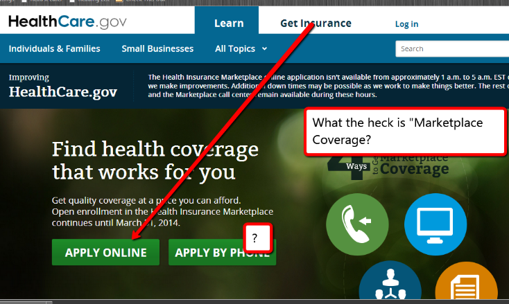
For example: Healthcare.gov’s website elements ae all over the place. Which call to action prompt is the correct choice? Who is the “Login” for? Where’s the information to understand what the site is about? There’s no coherent colour scheme, nothing to tie the website together.
Don’t forget to also run an A/B test on the mobile version of your website for increased engagement and maximised conversion.
4. Layout Design Elements:
Colours: A poor choice of colour may ruin your whole web page design. The text colour must contrast well with your background colour. Ensure you have no more than two main colours on your page so that visitor attention will be focused and guided toward your call to action.
What is the best colour for your links and buttons? Just remember, what stands out, gets clicked. What blends in gets ignored. Your website should have two colours. Passive colours and active colours. Passive colours are for your website design and brand. Action colours require people to take action.
Text: Keep in mind, people looking for information are looking for text, not pictures. Again, keeping your audience in mind pays off. Do some testing to figure out what text will make visitors more likely to click. Bold, italic or underlined? Font size is also very important to your design, test it.
You don’t have to limit yourself to only testing colour background or size text. Look at the various elements in your marketing sources and their possible alternatives for design, wording and layout.
5. Images
Since images can convey complex ideas and emotions quickly they are a phenomenal source for testing. Make sure you test high quality images, no pixilation or blurriness. The most basic image tests you can do are:
- Colour vs. black and white
- People vs. product
- One image vs. many images
- Masculine vs. feminine
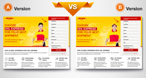
In above ab test a courier company wanted to know if a European courier image would drive more leads than an Asian courier image. Surprisingly, the Asian courier outperformed the European courier by 30% more lead conversions.
6. Headlines
Sometimes a single headline is all you need to communicate what you do, but a smaller secondary statement can be used to back it up and provide extra information while keeping your headline simple and to the point.
Many tests on headlines have been done in the past and most found that a headline focusing on a benefit generally performed the best. This might be due to people on the internet usually searching for solutions to problems.
Depending on your target audience, you might prefer using question headlines to stir interest, but you won’t know unless you test it. Headline test ideas:
- Long vs. short
- Positive vs. negative
- Benefited oriented vs. feature oriented
- Single headline vs. primary and secondary headlines
7. Text
Optimising the copy of your website is at least as important as optimising the design, especially if the primary goal of your website is to convert visitors. If you really want to get customers, you need to optimise the text of on your site to instil trust in visitors and make them want to purchase from you. Things to consider testing:
- Amount of text on the page (short vs long)
- Content near the fold
- Copywriting/ Sales copy and product descriptions
- Product pricing and promotional offers
8. Call to Action
Your call to action is what you want visitors to do and is considered the most influential element of your landing page. Consider the following for ab tests:
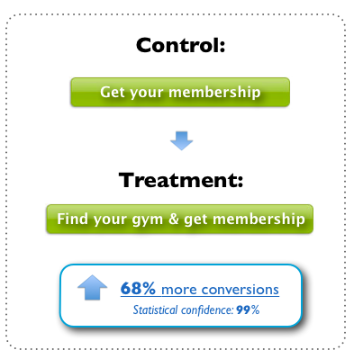
- Call to Action text: As the most crucial copy on your landing page, your call to action button text needs to be tested heavily. Try various lengths, pronouns, power words and action verbs.
- Call to Action Button: Your button colour is a very important feature and should be tested extensively. A contrasting colour that is distinct and stands out from your other website elements should work the best.
- Call to Action placement: The placement of your call-to-action has a major impact on conversions. Experiment with different placements of your call-to-action and see which one performs best.
9. Opt-in forms
Your opt-in form (also known as a “signup form”) should give your visitors a quick idea of your overall focus and draw them in. Remember what works for one company, won’t necessarily work for yours. That’s why you need to test different versions of your opt-in form.

10. Social proof
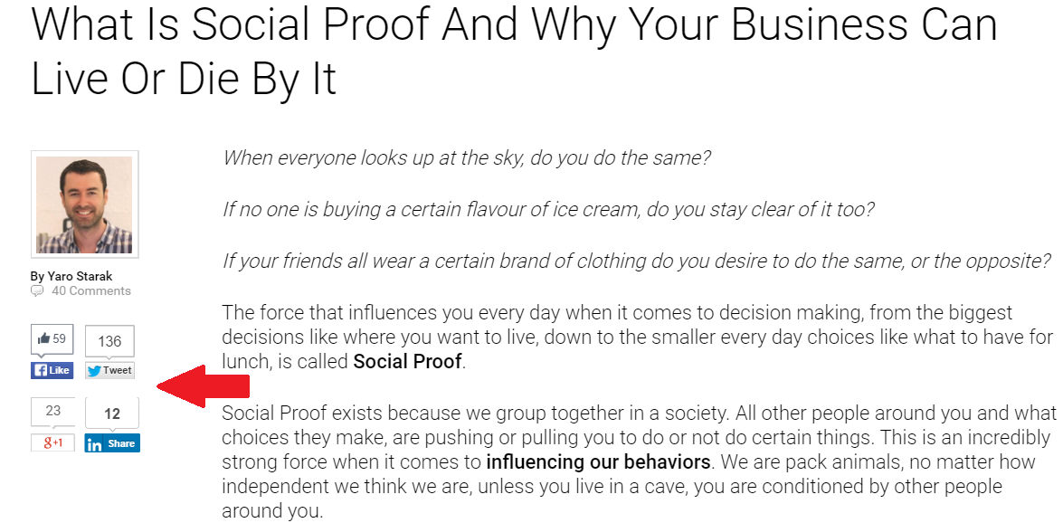
Social proof refers to the social share buttons placed within your landing page. By displaying the number of “shares” or “likes” the theory is that it can be used to provide social proof and gain users trust. If it works for your audience can only be determined by performing a split test. Version A displaying the number of shares, version B simply showing the social media icon without shares.
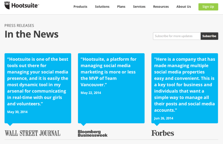
11. Media mentions
Testing what kind of media mentions you display on your website will allow you to know what kind of media sources you should visibly have on your site. If your control (version A) outperforms your variant (version B) then you know that you should stick to displaying your current media mentions.
12. Testimonials
Testimonials are a rarely-used element in copywriting and content marketing. We humans are emotional beings, but we also have logical aspects to our character and psychological makeup. Testimonials can be powerful credibility boosters. Test longer and shorter versions of testimonials, as well as the magic number of testimonials to include in your landing page
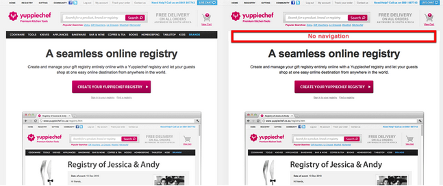
13. Navigation Bars
Simpler is usually better when it comes to landing pages. The easier you make it for visitors to focus on their primary objective, the easier it is to convert them into customers. But, you never really know what’s going to happen. Test different navigation bars, see image below, and get a better idea of how your audience will react.
14. Awards and badges
Badges and awards are potentially powerful tools for shaping your buyer’s behaviour. Like social share buttons, displaying the amounts of “likes” and “shares” each page receives, awards and badges could add credibility to your website. On the other hand, it may not. A/B test your landing page with and without awards to see how your audience reacts.
15. Email campaigns
- Subject line: Try different wordings to see what gets the most attention or test two different topics as the subject line.
- From name: Sender details are important because many people will not open an email if they don’t recognise who it’s from. Use different names: individual name, company name, product name etc.
- Delivery date/times: Determine when your subscribers are most likely to open your campaigns. Send each version to 50% of your email list. Then, use the winning time to inform when to send or schedule future campaigns.
After you’ve done some solid research, decided what to test and formulated a strong hypothesis, your next step will be to create and run you’re A/B test. You will then either prove or disprove your hypotheses.
Conclusion
Almost anything on your website can be tested. Whether it’s your headline, call to action button, links or image placement. By measuring the results and impact that changes have on your conversion rate you can ensure that every change produces positive results.
When it comes to optimising your landing page to increase conversions, it is difficult to create the right balance between data-driven decisions and using your intuition. Let A/B testing guide you.
So, what else can you do right now to optimise conversion rates and improve on customer engagement?
Discover
The 12 Marketing Secrets of Fast-Growth Companies
Find out what they do to achieve outrageous business success

Get your free copy

 By
By 
Post a Comment
You must be logged in to post a comment.