Why Taking Inspiration From Your Competitors Will Do Wonders For Your Marketing
T.S. Eliot once said that “good writers borrow, great writers steal”.
Marketing is no different. Great marketing isn’t about reinventing the wheel – it’s often about identifying what has already worked for others, and what aspects of their success you can adopt and, crucially, improve upon.
However, as much as we encourage businesses to build upon the ideas of others and not shy away from adopting and incorporating influences from elsewhere, we still laughed when we came across these flyers placed next to ours at the British Library.
Our flyer

Luckywebs’ Flyer
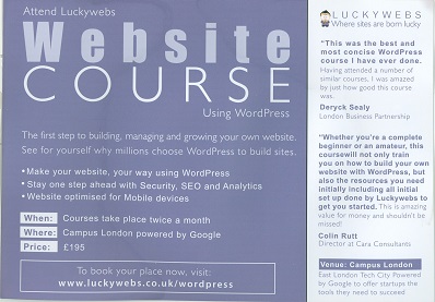
At first we thought that maybe they’d happened to use our graphic designer, but we asked her and this is what she said:
“Not at all Alasdair!
It really is a downright copy.
Naughty chaps – but quite flattering for you me thinks!?!
L”
This left us with only one conclusion – that the people at Luckywebs had copied our flyer design!
Errant apostrophe aside, the headlines were almost identical, even down to the fonts used.
Our headline

Luckywebs’ headline

Their flyer followed our structure very closely, including our when, where and price boxes.
Our Structure
![]()
Their Structure
![]()
The boxes containing our website information were almost indistinguishable.
![]()
![]()
The backs of the flyers were close to identical. Even the wording of “What you’ll learn” at the top and the “get your own 20 page workbook which is jam packed with practical information” at the bottom are the same.
Back of our flyer
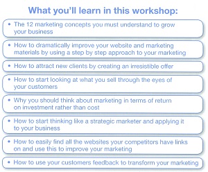
Back of Luckywebs’ flyer

That said, including the map and directions on the right hand side is a great idea, one which we might consider borrowing to use on our new flyers!

Although we were flattered, we did feel that because they copied the design so closely, they should have improved on it. We felt that the colour scheme and font choices they went for were actually a step back from what we had done. As well as this, their sales copy was nowhere near as strong, especially at the back of the flyer, which describes what their Masterclass will cover.
However, instead of feeling angry about it, as you might expect, we took a more philosophical view. It’s hard to point fingers and accuse people of copying when any creative endeavour is the sum of everything that influenced it. Without people copying and improving on things, as a species the human race wouldn’t have got very far.
Website Design Inspiration
When we were revamping our own website we took influences from other sites we liked. As a result, our website is a bit of a Franken-site. Just like Frankenstein’s Monster, it is sewn together from lots of disparate bits and pieces. Unlike Frankenstein’s Monster, our website is yet to kill any townsfolk.
For example, we happened to stumble upon the Tesco plc website and really liked their main navigation bar. We had been struggling with a way to tie our design elements, colour schemes and user-experience ideas into one coherent navigation bar. However when we saw Tesco’s we knew we had the answer to our questions. We loved the house icon, and the way the colours worked together, so we designed our own navigation bar to incorporate these elements.
So thanks for that Tesco!
Tesco’s Navigation
![]()
Our Navigation
![]()
In any niche or industry, it’s essential that you keep a very close eye on what leading marketers and leaders in your field are doing, and Grow are no exception. When developing our website, we kept a close eye on leading internet marketers, paying particular attention to aspects of their websites that we thought worked well.
On the Marketing Wizdom website for instance, they used a special sidebar widget that allowed visitors to scroll between different testimonials. Social proof is a hugely important aspect of marketing, and can often be the difference between converting a potential customer and losing them to a competitor. This was why it was very important that we incorporated our testimonials into our sidebar. We thought the scrolling functionality was superb and incorporated it into our own widget design, which suited our colour scheme and more stripped-back style.
Thanks very much, Marketing Wizdom!
Our Website Testimonial Widget
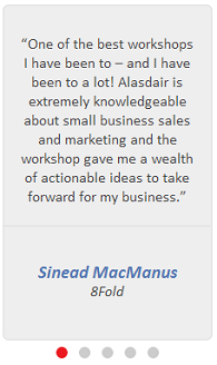
Marketing Wizdom’s Testimonial Widget
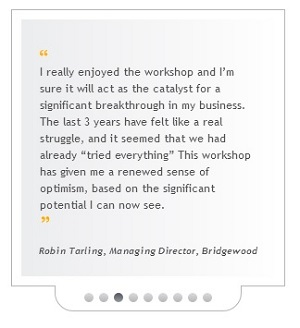
As well as the testimonial sidebar, it was also important to us that we had a dedicated testimonial web page, but we were struggling to find a way to present all the information we wanted in a way that was easy to read and nice to look at.
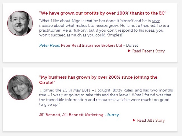
Most websites simply go for some text sandwiched between oversized quotation marks, but we wanted to incorporate our clients’ photographs and links to their businesses. This is to show that the testimonials were completely legitimate and given voluntarily.
We really liked how Nigel Botterill presented his testimonials as individual boxes, as it allowed him to incorporate clients’ photos and links in a uniform way, which is exactly what we wanted to do with ours.
Nigel Botterill’s Testimonials
Our Website Testimonials
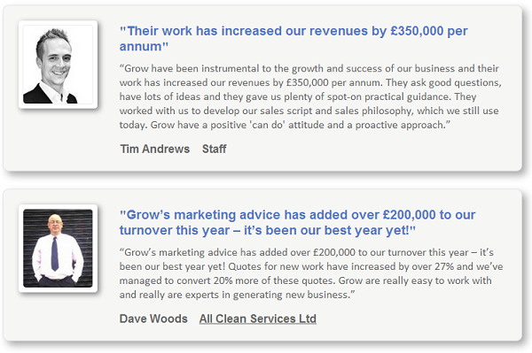
We created our own testimonial boxes, which were influenced by Nigel’s in the way they were laid out, but adapted to our own tastes, with the Polaroid-style photo borders and Grow colour scheme.
So thanks for the inspiration, Nigel!
If we were to list everyone who has inspired the Grow team in any way, this blog would end up longer than a Tolstoy novel, but we’ll use Alicia Cowan as one final example. We were trying to create a bullet-point icon that would really stand out and boost the impact of the copy, but everything we tried just looked uninspired and distracting.
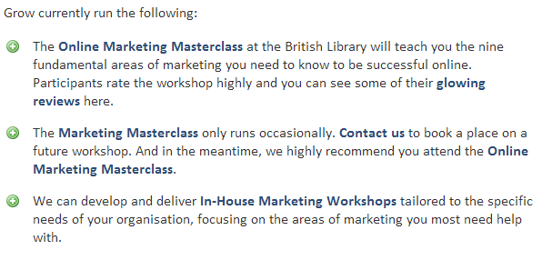
The answer to our design conundrum came when we were checking out Alicia Cowan’s Twitter Brilliance page and saw the green plus icons she used. We thought they were great and incorporated them into our own copy on some of our marketing workshop pages.
Below are screenshots from her Twitter Brilliance page, and our Marketing Workshop page.
Alicia Cowan’s Bullet Points

Our Bullet Points
So thanks for the great design eye, Alicia!
All these examples just go to show that taking ideas and building on them is not only acceptable in business, it’s advisable. Through adopting and improving upon successful ideas, everybody is literally mimicking the evolutionary process, whereby ideas are constantly improved with each iteration.
As business people, sometimes we have a tendency to shy away from adopting ideas from the environment around us, as if there is something inherently shameful about copying someone else’s idea. A desire to innovate is admirable, but improving on others’ ideas is just as valuable.
How far would humans have developed if scientists in the wake of Isaac Newton had refused to adopt his innovations and build upon them?
What would the world be like if Keith Richards of the Rolling Stones had refused to “copy” American blues music?
So, although Luckywebs committed the cardinal sin of copying our flyer’s design and not improving on it, it would still be wrong of us to chastise them, as imitation is the price we have to pay if we want to see our ideas evolve and develop. As well as this, being copied so closely is a good indicator that we’re doing our design right!
If anything, we felt flattered, so thanks Luckywebs, we’re touched!
Discover
The 12 Marketing Secrets of Fast-Growth Companies
Find out what they do to achieve outrageous business success

Get your free copy

 By
By 
I love your generosity of spirit… and your honesty when it comes to revealing your ‘inspiration’.