Could your Checkout Page be Costing you Customers? 20 Tips to Reduce Shopping Cart Abandonment
Nearly 7 out of 10 online shoppers abandon their cart without completing a purchase. Shopping cart abandonment is the practice of logging into a site, adding items to the cart and then exiting before making a purchase.
After getting them so close, they change their mind and leave; all of your hard work enticing them to visit was for nothing.
Online shopping cart abandonment has skyrocketed in recent years. Shoppers loose interest in making a purchase, or they simply leave your site. Why?
The following 20 tips can drastically reduce the amount of orphaned shopping carts on your site.
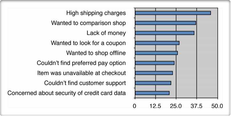
Most frequent reasons for shoppers to abandon their carts
1. Beautiful and responsive shopping cart design
It all starts when users add your products to their cart. The minute a visitor adds the first item to their carts, they’re not browsing – they’re shopping.
Shopping carts often come in two forms:
- A fully functional cart that is contained within a page of its own.
- A “mini” shopping cart, usually located in the sidebar, or above the page fold.
The best practice is to use both. It should be obvious when a user added something to the cart.
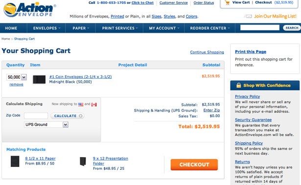
Shopify can make your shopping cart design stand out.
2. Allow users to save their carts
Many shoppers start browsing on one device, probably their mobile phone, then return later to complete the purchase on a different device.
Allow users to save their carts so that they have the convenience of completing their purchase at a later time.
3. Registration relief
Imagine: you finally find the perfect pair of running shoes, the one with the “See Me LED shoe cuff”. You’re ready to buy. A popup appears requesting you to first “Register to create an account”. Nope. Who’s got the time? You leave the website.
According to research by Convince & Convert, 86% of people leave a website when asked to create a new account. Sign-up forms are barriers because they take effort and time to fill out.
What you should do instead:
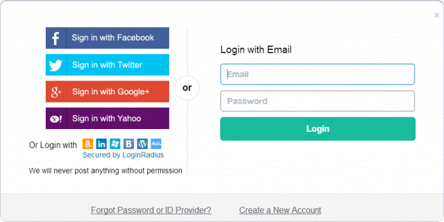
- Give your customers the option to “Checkout as a Guest”, as in the below screenshot, without signing up.

- Add social logins. Allowing your users to sign into your website using their existing social media profiles and likely the account where they came from. This enables users to seamlessly transition from being interested in your running shoes, to purchasing them without the hassle of creating an account.
4. Don’t make them enter their address twice
You could reduce shopping cart abandonment by simply providing an option to automatically fill in the billing address if its the same as the shipping address. Research shows that the fewer fields on a checkout form to fill in, the more likely users are to complete their transactions.
5. Focus on the customer experience
At the end of the day, people will buy from the websites that provide the best experiences.
Make sure your website is easy to use, appears authoritative and trustworthy, and provides consumers with the support and information they need to make a purchase decision.
Give your customers an experience they will want to share with others.
6. Demonstrate security and enlist trust
Privacy and security of personal and financial information are key concerns of online shoppers and a reason why some consumers avoid the Web.
Customers place items in the cart predominantly at online retailers whom they trust or are familiar with. Letting customers know that their information will be secure is a must.
Here’s what you need to do:
- Third-party reinforcement: Research shows that 21% of carts are abandoned when security concerns are unaddressed. Provide peace-of-mind with “trust logos”. Post badges from Verisign and Better Business Bureau, for example. Credit card logos are also important.
- Clearly state return and shipping policies, price-match guidelines, and privacy policies.
- Show them you are a real company by letting them know how they can contact you. Include your phone number, email address and live chat button.
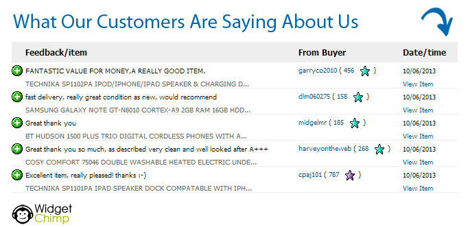
- Use online review widgets to boost trust during the buying process. By embedding customer review widgets into your website you can increase conversions by up to 58%, giving customers the confidence to go through with their purchase. Encourage customers to leave reviews and remember to respond to any negative comments.
7. Offer alternative payment methods
Always provide users the choice to pay how they prefer. Let the customer know. Some might feel more comfortable paying with plastic; others prefer cash on delivery.
Make it clear that you can handle everyone’s preferences. Some alternative payment options include:
8. Provide detailed product information
Many consumers use online carts as a tool to help them gather information prior to visiting a traditional, brick-and-mortar store.
To counteract this, you must strive to provide detailed product information online and also alert consumers of the possibility of buying the items of interest offline.
This shows you really care about the customer’s best interest and will go a long way to building trust.
The online shopper browses through many web pages in search of information. Shopping cart abandonment often occurs at the information providing stage of the checkout process.
This is due to shoppers using the shopping cart as a tool to compile information for a later purchase, rather than store the items for an immediate purchase.
- Keep consumers informed about price changes and sales.
- Allow shoppers to save their selected items. They are then able to continue evaluating their considerations during another visit or make a “wish list: for future purchases”.
- Items in the cart should be clearly displayed, along with any customisation or option-level information, like size and colour.
9. Relevant recommendations
Recommending related products before checkout is another excellent shopping cart practice. Shoppers want to be absolutely sure they have everything they need to get the most out of their purchase.
Recommendations based on previous shopping history increases your customer loyalty by reproducing product evaluation as well as search costs.
- Use customers’ social history of likes and dislikes to deliver relevant recommendations to users.
- Increase recommendation accuracy by paying more attention to your recommendation algorithms when the product recommendation service is deployed.
- Allow visitors to stay in the shopping cart environment while reviewing recommended products.
- Make recommendations via popups, which keeps shoppers’ primary order in full view.
- Test the number of recommendations you make.
10. Answers and assurances
- Anticipate last minute questions and address customer doubts. When you add links, sidebars or popup windows with information about frequently asked questions (warranties, shipping etc.), you’ve provided assurances at the right time and place.
- Consider testing a live chat option on your checkout page in case the customer has any pre-sales questions before placing an order. You can take this data to create a list of frequently asked questions with corresponding answers. Test placing the FAQ’s above the fold or below the checkout page. Placement can also affect your conversion rate.
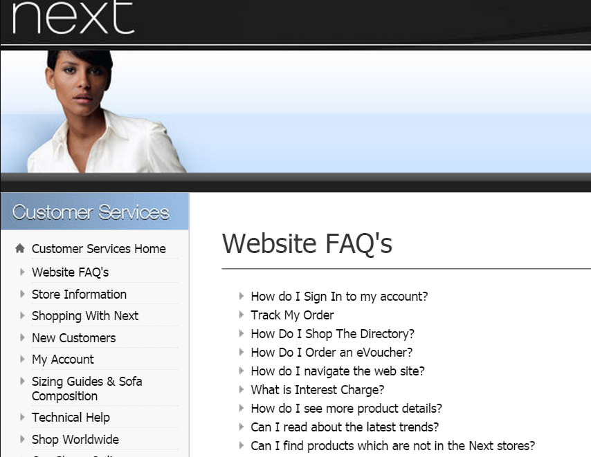
11. Simplify your checkout process
According to Econsultancy, 44% of UK shoppers abandoned at least one online shopping transaction in 2014 after becoming frustrated with the length and complexity of the process.
Research shows that the less time it takes to complete the checkout process, the higher the conversion rate.
Make it obvious what to click next. Ask yourself: “If my grandma had to go through this process would she understand which button to click next?” If she wouldn’t, then you need to clarify.
Keep the number of steps it takes to make the required purchase as low as possible. Preferably somewhere between one and seven. Make the checkout process as simple, easy and clear as possible. Avoid repetition and distractions.
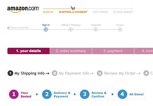
12. Let shoppers know how far they’ve gone
Number and label each step. Use graphic indicators on each page. Give them the opportunity to review previous steps, moving back and forward without getting lost.
13. Reassure prospects with images
Including multiple high quality product images will help your customers be more confident in their purchase decision. VoucherCloud found that 92% of people identified “visuals” as being a top influencing factor that affected their buying decision.
- A positive image stimulates positive emotions. Use images to make your customers feel good, proud and wanted.
- Consider using a Mascot to create a bonding experience with visitors.
- Use human faces to increase engagement and relatability. MedaliaArt A/B tested using images of the paintings (Test A) and photos of the artists (Test B). Their site experienced a 95% increase in conversions when implementing Test B.

Your customers will need to review their basket before completing the purchase. Make sure you add pictures and product specifications – e.g. size, colour.
Link these items to their product pages just in case the customer wants to verify that it is indeed the right item.
14. Keep them focused
People get distracted. Don’t give customers an opportunity to click away from the checkout page. When you include navigation bars, or any information other than a progress indicator, you’ve given them an out. No navigation bars, no unessential links.
- Don’t interrupt the flow
- Cross-sell only at the last moment: Don’t be pushy. Refrain from selling other items right from the start. Suggest items they might be interested in when they’re ready to order.
15. Be transparent
Be completely transparent about the true total cost of items, including expected delivery. Don’t wait until the very end of the transaction to add on the tax. Offer this information from the start.
Avoid surprises at checkout by allowing users to calculate shipping, taxes and discounts right in the cart.
Shipping times should also be displayed with your rates – shoppers should know exactly how long it will take for their order to arrive.
16. Offer incentives
Offer free shipping for orders exceeding a certain value. Make this clear to the prospect. Show them you care.
17. Call to actions
Your call to actions must be clearly highlighted. View cart, continue shopping or complete your order.
Make your call to action buttons subtle, but strong enough to encourage customers to return to their shopping basket.
18. Return policy
Having a direct link to your return policy might help customers to review it and realise how easy it is to send items back. This will encourage them to trust your brand.
19. Recovery emails
One of the most effective ways to recover abandoned carts is to follow-up with a well-crafted email campaign. Example from Monetate.com:
20. Close the deal with videos
According to Kissmetrics, a short video tutorial or demonstration can help reduce cart abandonment rates and increase sales. A well-produced video can even enhance the user experience. Keep it short, 30 seconds to 1 minute, and include some catchy music.
Conclusion
An item in a shopping cart is never a guaranteed sale. There are a multitude of reasons customers do not complete their transaction. Eliminate as many of those reasons as possible by implementing the above 20 tips.
Always keep in mind that even the smallest detail can make a difference between conversion and shopping-cart abandonment. Keep your checkout process quick and easy.
How are you preventing shopping cart abandonment? Let us know your best tips and techniques in the comment section below.
Discover
The 12 Marketing Secrets of Fast-Growth Companies
Find out what they do to achieve outrageous business success

Get your free copy

 By
By 

First, fantastic in-depth post on shopping cart abandonment! Second, any thoughts on addressing the customer expectation of #16 “Free Shipping”? Most small online companies can’t pay the shipping cost as it reduces their margins.